Interior Trends
The Pantone Official Colour 2020
Jan
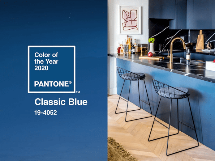
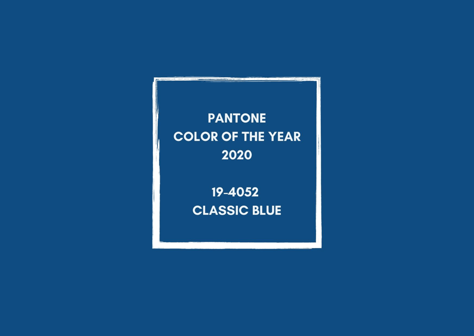
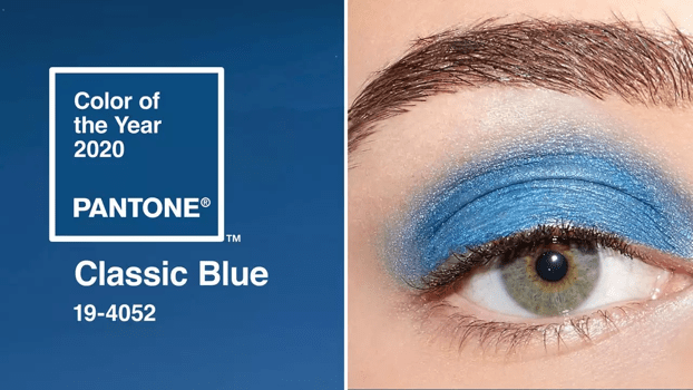
PANTONE 19-4052 CLASSIC BLUE
Instilling calm, confidence, and connection, this enduring blue hue highlights our desire for a dependable and stable foundation on which to build as we cross the threshold into a new era. Explore Classic Blue 19-4052.
The PANTONE Colour of the Year highlights the relationship between trends in color and what is taking place in our global culture at a moment in time, a color that reflects what individuals feel they need that color can hope to answer. As society continues to recognize color as a critical form of communication, and a way to express and affect ideas and emotions, designers and brands should feel inspired to use color to engage and connect. The Pantone Color of the Year selection provides strategic direction for the world of trend and design, reflecting the Pantone Color Institute’s year-round work doing the same for designers and brands.
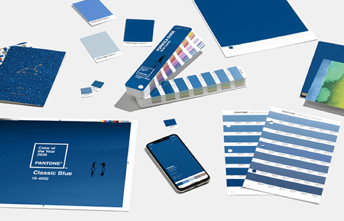
The Pantone Color Matching System
The Pantone Color System is the most important color matching system in the world. The system originated in 1963 to solve the problem of complicated color matching in the printing industry. Soon after, Pantone became the easiest and simplest way to classify, communicate and match colors with the use of a color catalog in a fan format. Every color, in every tone and tint, was given a number to classify it. Pantone literally wrote the book on color matching. For over 40 years, Pantone has been the go-to color matching system for not only the design industry but also paint, textile and plastic manufacturers.
The Pantone Color Institute
The Pantone Color Institute offers designers, marketers, creators and brands a chance to work together and build a strong and powerful color presence. As the leading color matching system, their knowledge of color is unparalleled. They are the experts in how color affects not only design but also consumerism.
CLASSIC BLUE FOR MULTI-SENSORY EXPERIENCE
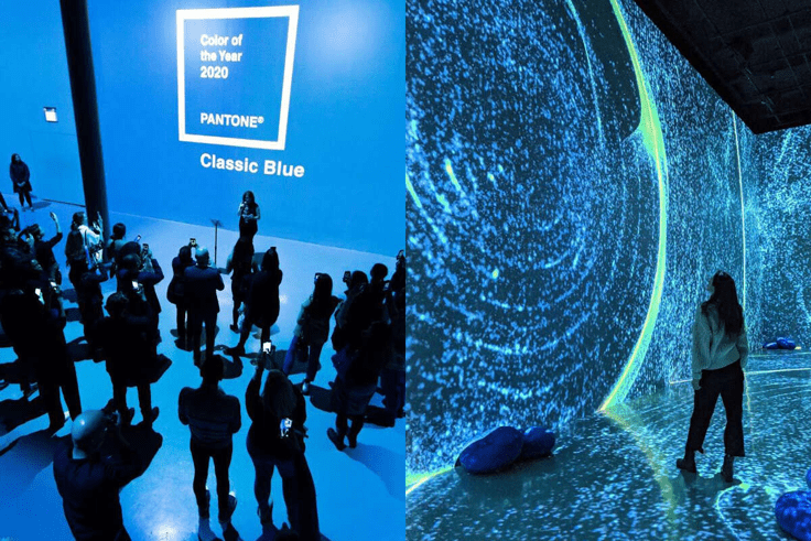
Taken together, all of these sensory inputs have been designed to inspire creatives and consumers to think about color differently, to uncover new patterns and associations, and to encourage them to create new experiences that speak to people’s hearts as well as their minds.
The Sight of the Color of the year 2020 Pantone Classic Blue. A restful color. Classic blue brings a sense of peace and tranquility to human spirit. Classic blue fosters resilience.
The sound of the color of the year 2020.The sound of Classic blue is nostalgic, comforting and familiar.
The texture of the color of the year 2020.The feel of the color fabric translates into a soft, velvety texture, further emphasizing the calming quality of the color, while eliciting feelings of empowerment to expand the mind and build foundation for the future.
The taste of the color of the year 2020.The taste of the color is described as gentle and elegant, and explores the idea of maturing through ripening.
The scent of the color of the year 2020.The scent of the color elicits contemplation and a feeling of optimism for the future, with notes of blue water and sea salt lifted by airy sky.
THE INFLUENCE OF CLASSIC BLUE IN MARKETING TRENDS
The Pantone Color Institute studies color trends throughout the year in order to decide on the next Pantone Color of the Year. They take into consideration all aspects of society: fashion, marketing, social media and even politics. The hue chosen as Color of the Year has become increasingly influential in the vast world of design and brand marketing.
Fashion.PANTONE Classic Blue is a poised and self-assured blue hue elegant in its simplicity. PANTONE Classic Blue takes on distinct appearances through application to different materials, finishes and textures from shimmering metallics, lustrous sheens and high-tech materials to hand crafted looks and more fragile fabrics

Cosmetics. PANTONE Classic Blue makes a dramatic statement for eyes, nails and hair in a variety of finishes from glittery and glam to dusty matte.
Home Decorations. PANTONE Classic Blue is a pervasive favorite for home. Creating a stable foundation from which to build, PANTONE 19-4052 Classic Blue injects creative confidence into interiors, transforming a space through unique color combinations and tonal statements. Easily applied across so many different materials, textures and finishes.
Graphic Design and Packaging.Because of PANTONE Classic Blue’s relation to the sky at dusk, something we see every day, it maintains a perception of dependability and constancy. A color we respond to viscerally as being trustworthy, PANTONE 1 Classic Blue is an ideal shade for many applications of graphic design. This is especially true for packaging where PANTONE 19-4052 Classic Blue conveys the message of honesty, credibility and reliability that today’s consumers are connecting to.